Friday, December 23, 2016

2016 Photochallenge Week 51: Happy Holidays

Nearing the end of the year now and I've played along with at least 50% of the 2016 photochallenge.org challenges!  This has been a really fun way to push myself to try new techniques and take shots of things outside my usual comfort zone.  I have not done many of the portrait challenges though.  Meh.

Photochallenge Week 51: Happy Holidays

This week the challenge was to create a photo holiday card.  I wish I had done this earlier in the season so I could print and send these out!  Oh well, consider this my virtual greeting card to you!

This past weekend I camped out in our basement with my camera to observe and shoot various birds as they flitted to our two feeders out back.  The outside temp ranged from -30 to -15 that day but the sun was out and the birds were going crazy.  Some snow flurries came and went in the morning and I managed to catch this chickadee in a moment of silence with snow flashing around him. Perfect!  I did do a little Lightroom post production on this to blur out some house details in the background.  Then I put in in Photoshop CC and added a text layer with an edge glow fx.  I thought about doing a border, but felt this would affect the mellow nature of the picture.  


Have a merry Christmas, or whatever holiday you celebrate!  

Thursday, December 22, 2016

2016 Photochallenge Week 50: Levitation

Nearing the end of the year now and I've played along with at least 50% of the 2016 photochallenge.org challenges!  This has been a really fun way to push myself to try new techniques and take shots of things outside my usual comfort zone.  I have not done many of the portrait challenges though.  Meh.

Photochallenge Week 50: Levitation

This past week's Challenge was to use levitation in a photo.  This was open to interpretation and several methods could be used for it.  Some where simply fast shutter speeds to catch someone in the air while jumping.  Others were using people or items on stools or hanging from strings and "erasing" the connection to earth in post production.  

I've been doing some on-line Photoshop CC classes through Creative Live and have been learning some fancier techniques of masking and creating composites, so I thought this would be a good time to try this out.  

I took a small monkey table (yes I just happened to have this tacky piece of furniture laying around to my wife's dismay) and removed the glass top.  Placing this against a black back drop with simple one-source lamp light, I took a few base shots of the monkey.  Next, with the same set-up I took pictures of several of my ape and monkey themed books.  Who knew I had so many in my home library?  Next up I fired up Photoshop CC and started a base layer of the monkey.  I opened each book photo on its own, did some minor tweaks to it, then selected the book out from the dark background and copied it into a new layer over the monkey.  Repeat.  I added a drop shadow to the books on top to add 3 dimensional effect to the floating stack.  It isn't perfect but I got a chance to try some interesting effects, including rotating and transforming a few of the books.


And there you go!  A monkey in a fez (fez's are cool again)  levitating a bunch of books!

Thursday, December 8, 2016

PhotoChallenge Week 48: Bokeh

Nearing the end of the year now and I've played along with at least 50% of the 2016 photochallenge.org challenges!  This has been a really fun way to push myself to try new techniques and take shots of things outside my usual comfort zone.  I have not done many of the portrait challenges though.  Meh.

Photochallenge Week 48: Bokeh

For those who aren't familiar, bokeh is a term for the blurred light in the background of some shots.  Think of the sparkles from streetlights or Christmas trees in the background of some shots.  This can be distracting or a flaw in the picture, or can really accentuate and improve a shot--leading to a dreamy quality.

The ideal set up for Bokeh shots is using a small f-stop (2.8 f) to focus in close, with resulting blurring of the lights behind.  The lowest my lens would go was 5.8 f and I got too much detail in the background.  So I cheated!


I ended up using an unfocused shot of the Christmas tree in our living room as background.  I then took some miniature X-Wing game Star Wars ships (Fantasy Flight Games!) and took some macro shots of them against a black background.  Then I combined the two shots in photoshop after erasing the plastic stands that the ships stood on.  The result looked pretty cool, but I went a step further and added some green laser blasts from the stalking TIE fighter!  The toughest part of this process was getting a decent fire effect at the impact point of the blasts.  There has to be an easier way!  I also added a bit of motion blur to the Falcon in order to give the impression of movement.

Thursday, December 1, 2016

Inspired By Reading: Sabriel

A friend of ours, Andrew Thornton, started up a virtual book club a few years back called Inspired By Reading.  Like most book clubs, each month a new book is read, but instead of just talking about the book the members of the group are challenged to create something inspired by the book.  Most of the members are artists--especially jewelry designers--so this is a very visual take on the classic book club.  I've taken part sporadically, but my wife pretty much gets every month's challenge done.


This month's selection is the first in a young adult series by Australian author Garth Nix.  Sarajo got me to listen to the first book several years ago on disk and I promptly read or listened to the rest of the series as well.  The audio is read by Tim Curry (of Rocky Horror and Clue fame) in an extraordinary way!  

Though the protagonist is a teen girl and the books are marketed as young adult, these deal with dark themes and are quite complex.  The book begins with Sabriel finishing up her time at school in a world that seems a lot like WWI era Britain.  Soon she is thrust into claiming her birthright as Abhorsen--a magician of sorts tasked with keeping the dead in their place and keeping the world safe.  

I really, really like this series.  Since I work in photo rather than jewelry--I had a few ideas of things to try with my meager Photoshop powers.  The Abhorsen has a magic sword and uses a set of bells to command the undead back into their place in death.  Death is viewed as a dark river with 10 gates or falls, each one leading farther into the final resting place past the 10th gate, with occasional restless dead attempting to make their way back to the land of the living.


1) Abhorsen!  Here's my take on Sabriel's father (The Abhorsen prior to her taking over the job).  For this shot I took a few shots of myself dressed in cloak with sword and bell, followed by a few creepier shots of myself crouched over with a ghoulish mask on.  I superimposed my Abhorsen self into a swamp shot from our visit to Ligonier, PA this past summer.  I then warped and erased an underlying shot of myself as one of the restless dead into presence in the shot.  I'm still learning technique here and I'm pretty happy with most of the shot, but feel like I'm a bit too stark in the foreground.  


2) The Restless Dead:  Here's the underlying shot of myself superimposed on a solarized waterfall shot from a trip to Duluth this summer.  I elongated my jaw/teeth and fingernails and warped my body to seem unnatural as well.  I used a radial blur filter to blur out the outside edges and focus on the creepy self portrait.  Oh, and gave myself glowing red eyes of course!

Monday, November 21, 2016

2016 PHOTOCHALLENGE, WEEK 46: URBAN DECAY – SELECTIVE COLOR

Over the past 2 years now, I've been taking part in the PhotoChallenge.org weekly photo challenges.  The goal of these challenges is to get people taking pictures every week, gain inspiration, and to try new techniques.  I've done pretty well keeping up (except those portrait challenges) and have tried a lot of new things.  In these blog posts I'm going to post my response to this week's challenge, as well as some of my older pictures that fit the criteria... Oh, and feel free to take part, this is a free and open challenge for all budding photographers!

2016 PHOTOCHALLENGE, WEEK 46: URBAN DECAY – SELECTIVE COLOR

Last week's challenge called for Urban Decay...but I couldn't leave my very Rural town the whole week due to family and work getting in the way of my photography!  So I trolled though my back stock and found a suitable shot for this challenge.  The idea of the challenge is to desaturate most of the picture to black and white or sepia while leaving behind one color (or more) to give a different look/impression.  I've been a fan of this technique for a while and have been trying out a few such shots myself.


This is a shot I took in Asheville NC last year.  I actually replaced the sky (very pretty and blue in the color shot, but boring in black and white) with another cloud shot from the same trip.  Then I desaturated every thing except red using Lightroom CC.  I think the effect is pretty cool.  I almost greyed out the brick to leave just the grafitti.  


Friday, October 28, 2016

2016 PhotoChallenge Week 43: Little Planets

Over the past 2 years now, I've been taking part in the PhotoChallenge.org weekly photo challenges.  The goal of these challenges is to get people taking pictures every week, gain inspiration, and to try new techniques.  I've done pretty well keeping up (except those portrait challenges) and have tried a lot of new things.  In these blog posts I'm going to post my response to this week's challenge, as well as some of my older pictures that fit the criteria... Oh, and feel free to take part, this is a free and open challenge for all budding photographers!

Week 43: Little Planets

This week's challenge was a cool one.  Take a panoramic photo and manipulate it into a little planet.  There were some phone apps that did this, but I tried it out in Photoshop.  I actually didn't get a chance to go out this past week to take a good picture for it, so I used some older shots to practice the technique.

The steps:

1)Either take a panoramic shot or crop a landscape into a panoramic shape.  Ideally there should be some empty sky since it will be easier to meld together in the final product, but clouds can be cool too.

2) Change the size of the shot to a square (use the same height and width dimension) which will oddly elongate everything and look crazy.  Make sure to uncheck the constrain dimensions box or chain icon or this won't work.

3) Flip the shop upside down.

4) Use the Filter-->Distort-->Polar Coordinates to turn this into a circle.

5) The hardest part: Do your best to blend, clone stamp, and healing brush the edges and line where the photo touches upon itself.

An option that is a little more difficult has you copy and flip the photo so you get a mirror image on each side of the shot--this makes it line up well on the final product but does duplicate the resulting photo so it can look odd.  I did this with the below shots since my edges were not lining up well.


Sunrise!  I like this shot a lot and the silhouette makes it easier to blend the middle.  You can tell this was duplicated, which I don't love, but the other method left a huge line in the center that was near impossible to blend due to the complicated cloud patterns.  In a blue sky shot the odd streaking at the 4 corners is minimal and easy to blend away.


Wind.  This one was an odd long shutter speed shot I did last fall during some high wind.  To get this outside-in look all I did was skip step #3 above and this was the result.  I like the duplicated cloud pattern that looks like a dragonfly!  I wish the original had had less tree movement so only the foreground was blurred.

Thursday, October 27, 2016

Inspired By Reading Book Club: Vampires in the Lemon Grove


A friend of ours, Andrew Thornton, started up a virtual book club a few years back called Inspired By Reading.  Like most book clubs, each month a new book is read, but instead of just talking about the book the members of the group are challenged to create something inspired by the book.  Most of the members are artists--especially jewelry designers--so this is a very visual take on the classic book club.  I've taken part sporadically, but my wife pretty much gets every month's challenge done.


This month's book was a short story collection by Karen Russell named after the title story Vampires in the Lemon Grove.  I didn't read the whole collection--I'm in the middle of two short story collections already--but did read the title story since I like vampires.  The story was strange, somewhat haunting and wistful.  I liked it and didn't like it at the same time.  I like the imagery of two vampires finding each other and falling in love for centuries, but just didn't really "get" the whole thing.

Regardless, here's my artistic inspiration from the story:  I struggled with this a bit, but eventually got it looking OK.  I took a macro shot of a handy lemon--destined to be used in a cocktail--for the background.  Then I discovered a shot of a fruit bat that I took on our summer trip to visit Andrew and William in Ligonier, Pennsylvania from the wonderful Pittsburgh Aviary (where the Lorakeets pooped on my).  I manipulated the picture to fit over the lemon.  The tough part was getting the edges to look right and it still isn't perfect, but I learned some new Photoshop techniques in the process.


Thursday, October 20, 2016

2016 PhotoChallenge Week 41: B&W Wealth

Over the past 2 years now, I've been taking part in the PhotoChallenge.org weekly photo challenges.  The goal of these challenges is to get people taking pictures every week, gain inspiration, and to try new techniques.  I've done pretty well keeping up (except those portrait challenges) and have tried a lot of new things.  In these blog posts I'm going to post my response to this week's challenge, as well as some of my older pictures that fit the criteria... Oh, and feel free to take part, this is a free and open challenge for all budding photographers!

Week 42: B&W Wealth

Last week we were tasked with getting a picture that personifies "Wealth" in black and white.  It was interesting to see people's takes on this one.  Lots of fancy cars and houses, but some more intangible ones like love and natural resources as well.  I went pretty literal on this one and broke out my old childhood coin collection to set up for a macro shot or two.  I used coins from 1800's to the 1980's since coinage hasn't changed a whole lot over that time, other than the actual worth of the coins themselves.


Friday, October 7, 2016

2016 PhotoChallenge Week 40: Graffiti

Over the past 2 years now, I've been taking part in the PhotoChallenge.org weekly photo challenges.  The goal of these challenges is to get people taking pictures every week, gain inspiration, and to try new techniques.  I've done pretty well keeping up (except those portrait challenges) and have tried a lot of new things.  In these blog posts I'm going to post my response to this week's challenge, as well as some of my older pictures that fit the criteria... Oh, and feel free to take part, this is a free and open challenge for all budding photographers!

2016 PhotoChallenge Week 40: Graffiti

This week we look at graffiti as art.  I've been intrigued by street art for ages, especially at the fine line between this being art versus vandalism.  I'm certainly more partial to the graffiti that shows some artistic talent instead of just putting you tag on some piece of turf...


1) Crash:  This week, I've been mostly out in Waconia (a far Western suburb of the Twin Cities) with a dearth of urban street art.  We did get a brief sojourn into downtown Minneapolis on Sunday for the wedding of some friends at Day Block Brewing, and I discovered this little shot on the way in.  Not thrilling, but I kind of like the crashed out car in the background...


2) Lurking Cat: This is a cool spot in Asheville, NC with graffiti style murals and several bronze cats scattered about.


3) The Wrong Side of the Tracks:  This is another shot of Asheville...


4) What?  Me Worry?  This one is from Portland, which is just coated in graffiti.  Just about every building, street sign, and open area in certain parts of town are tagged with the stuff.  Some are silly, some beautiful, some just messed up.  You judge which this one is...

Friday, September 30, 2016

2016 Photochallenge Week 38: Mirrored Water Reflections

This past week's photo challenge was to use mirrored water reflections.  I really like this type of picture and try (key word here) to take such pictures when I see the opportunity.  Often though, this type of shot requires some planning to make the right time of day, and often hopes that you will find a nice subject to make the shot stand out.  We had rain and overcast days pretty much all week that I was free so I had a hard time getting a good photo for this.  I am posting a couple of shots from my recent trip to Florida that fit the bill as well!


1) Pumpkin!  With all the rain this week, I discovered a puddle on top of my deck table and posed this little pumpkin (that I stole from Heather) in the puddle.  The overall shot was too drab and not much of color came through in the reflection.  To remedy this, I turned the whole picture black and white except for the reflection and then accentuated the color slightly.  I like the look overall.


2) Pelican:  I liked this shot of the pelican in the hippo grotto at Disney's Animal Kingdom.  The water was a little grungy so it isn't perfect but oh well!


3) Disney!  This is a night shot from across the bay at the Boardwalk.  I didn't have a tripod so had to brace the camera on a railing so it has a little motion blur for this long exposure.  I had  few more with a ferry boat coming in that looked very odd (the boat was elongated due to long exposure).

Wednesday, September 28, 2016

Drinking at Disney Part 2!

HERE is a link to my second post for Beerploma on Drinking at Disney!  We focus on Magic Kingdom, Animal Kingdom, and Disney Studios.


Enjoy!

Sunday, September 25, 2016

2016 Photochallenge Week 37: B&W Shapes

Week 37 of the Photochallenge.org 2016 challenges encouraged us to take a black and white picture that focuses on shape.  This one is up my alley for sure since I'm a lover of B&W.  Hey I grew up with a black and white TV!  Try watching Voltron on B&W and having no idea what color the lions were...  I also used to help my mom develop her B&W photos in the dank and spidery basement of our old Hopkins home.


1) Sad Umbrella:  I saw this sad looking broken umbrella floating in a showy fountain at Disney's Epcot theme park and just had to take a few pics of it.  I think the geometric shape of the umbrella works for this challenge.


2) Spaceship Earth:  The classic giant silver faceted ball that is the centerpiece of Epcot, as well as a strange ride through the history and future of the human race on the planet Earth.  I took this with my iPhone since I left the camera at home most of the trip.


3) Gears:  This pic was taken just outside Lake Monster Brewing at the Vandalia Building in St. Paul.  They have all these cool old giant gears bolted to the exterior walls from when the building used to be a mattress factory.  I couldn't pass up the opportunity to snap a few shots.

Wednesday, September 21, 2016

2016 PhotoChallenge Week 36: Ground Level Perspective

With my recent travel I've fallen behind in posting my attempts at the weekly Photochallenge.org assignments.  I'll work on catching up now!

Week 36: Ground Level Perspective

The challenge for this week was to get a different viewpoint in your shot--get down low instead of using the typical eye-height of most photos.


For this shot I got right down on my belly in the grass and took several pictures of this green frog.  I think it adds a "from the wild" viewpoint.

And there you go!

Drinking Around the World at Epcot!

Hey readers!  In case you hadn't noticed, I've started to write beer blog posts for Beerploma, and HERE is a link to the first of my Drinking Around Disney posts focusing on Epcot.

Enjoy!  Also make sure to like/follow Beerploma to stay up on future posts.


Friday, September 16, 2016

Beerploma Bound!

I've been a little quiet on the blog recently due to vacation, family stress, and just a little bit of ennui.  So after talking with Dan from Beerploma, I've decided to join the staff there for my future beer blog posts as a way to kick myself up a notch and try to change things up a bit.  I've been doing this blog for several years and certainly have some dedicated followers that might find this change surprising.  Don't worry, I'm still going to be writing about beer!  My honest reviews of beers and breweries will continue, but under a new name.  I'm also excited about the potential for collaborative blogs and podcasts with Dan and Will in the future.  I think this change will help push me to get out of my current rut.  I'll probably focus more on photography and personal stuff on this blog space for now.

Please check out Beerploma and my first article for them: Up From The Depths: A Lake Monster Brewing Review (and yes that is a Godzilla reference...)

Cheers to a new endeavor!

--Eric

Wednesday, August 10, 2016

2016 PhotoChallenge Week 32: White on White

At the end of last year I discovered Photochallenge.org.  This is a small group of photographers who set forth a weekly challenge to other professional and amateur photographers.  What I was drawn to with this weekly assignment is that is pushes you to try new techniques and get out and take pictures on a weekly basis.  I'm taking part again this year and will also do a quick blog post about each of them.  The rules of the challenge do require that these are new pictures, not from your back catalog.  With my busy work schedule, I may not be able to get out each week and do this, so I will likely add a few of my older photos on the blog--taking the opportunity to look at the plethora of pictures I've taken and actually do some processing and weeding.

2016 PhotoChallenge Week 32: White on White

I've been super busy the past few weeks and haven't had much time for blogging.  But this week's photochallenge was worth a quick one.  The goal of the challenge is to do a white subject against a white background--but not to shoot in black and white.  A pop of color is acceptable. 

I broke out my small lightbox and used a couple of small lamps to either side to get a more diffuse lighting on this. I set up my camera on a tripod for a bit longer exposure and some stability.  I also used a curved sheet of heavy white paper as a base for the set-up.


1) Eggplants:  I grew these cute little albino eggplants in the garden this year (the only ones not eaten by our annoying local rabbit population).  I liked this set and think the green adds some contrast to the shot. 


2) Eggs! This one is pretty self explanatory. I was going to do a dozen eggs and one brown or bluish one--but these were the only white eggs we had from our meat and egg CSA TC.Farm.  


3) Rollin' Dice:  I got more shadow on this one than I wanted, but it still looks decent.  


Overall a fun challenge and got me a little more practice with white backgrounds!

Thursday, July 28, 2016

Inspired By Reading Book Club: The Fault In Our Stars


A friend of ours, Andrew Thornton, started up a virtual book club a few years back called Inspired By Reading.  Like most book clubs, each month a new book is read, but instead of just talking about the book the members of the group are challenged to create something inspired by the book.  Most of the members are artists--especially jewelry designers--so this is a very visual take on the classic book club.  I've taken part sporadically, but my wife pretty much gets every month's challenge done.

This month's book is John Green's The Fault In Our Stars.  The book was turned into a movie that was actually well done and kept very close to the source material.  But I suggest reading the book instead!  The book is told from the point of view of Hazel, a teen who is in treatment for thyroid cancer.  Hazel meets a young man, Augustus Waters, in a support group meeting and the resulting relationship is one of the most real and poignant that I've come across in all my years of reading.  Oh, and spoilers: you will cry like a little baby when reading or watching this.

As a pediatrician, I spent my share of time in residency taking care of families (not kids--families) undergoing cancer treatments and bone marrow transplants.  These are the sickest kids you will ever take care of in my line of work, many balanced chronically on the knife edge of life and death.  I would never give up my memories of that aspect of my training, but it was the most difficult thing I've ever done in my career.  The emotional and physical toll that the process takes on the patients, their families, and yes--even on their health care providers--is astonishing.  On the positive side, kids and teens are remarkably resilient, both physically and emotionally, often handling things much better than adults do.  I felt that the book really captures the emotions and situations of these teens in a way that feels true and isn't just calculated for cheap sobs.  The teens' take on their doctors and nursing staff isn't always complimentary, but this also feels very real to me.

So, how can I take inspiration from this book?

My first effort relates to Augustus' family.  His parent's home is littered with all sorts of cross-stitched samplers with inspirational sayings that they call "encouragements".  Taking a quote from Hazel's favorite book An Imperial Affliction, I made my own "encouragement" for her!  I had to first make a background in Photoshop CC to imitate fabric.  This took quite a bit of effort, but I figured it out via tutorials on the web.  I next downloaded and altered a cross-stitch font and made my own paint brush using one stitch.  I went a little overboard on it, but why not!


My next effort was related to Hazel's lungs.  She needs to be hooked up to oxygen because--in her own words: "my lungs sucked at being lungs".  I drew a pair of shoddy looking lungs and then did a clipping mask overlay with a shot of smoke that I had previously taken.  I then gave the lungs a bit of an outline glow and embossed texture to differentiate from the black background.  Not my best work, but I was trying new techniques!


I had other ideas, but ran out of time.  Read this book.  Seriously.

Thursday, July 21, 2016

No Need For Modesty: Modist Brewing Review


Based on the number of disappointing first visits to new breweries I've suffered through over the past few years, I now rarely visit a brewery unless it's been open over 6 months.  Every once in a while I hear enough positive reviews from people I trust, that I'll break this rule and check them out.  Modist Brewing is one of these breweries.  Open since April 2016, this North Loop brewery is located very close to Fulton's taproom--giving you just one more reason to visit the area!

The brewery was started by four friends: Keigan Knee (head brewer), John Donnelly (head of sales), Eric Paredes (chief manager), Kale Anderson (operations manager).  I haven't met these guys but I'd like to!  Their website set-up and pictures certainly point to a great sense of humor...

This particular Saturday, we had two friends in from Colorado and wanted to show them around some of our favorite watering holes.  Since we were already at Fulton, we decided to sprint through the rain to the Modist Taproom.  Why not right?

The open and spacious taproom was busy but not insane, with only a short wait for beers.  The brewery itself is off to the right as you come in the door, a colorful bluish glow reflecting up from the floor upon the shiny stainless conical fermenters.  There's also an open patio area that was empty on this trip due to pouring rain.  At one point I thought I saw someone riding a bike around inside the circle of equipment, but by the time I grabbed for my camera he was gone--like a strange hipster brewery ghost.


The Beers

I can be in the fanciest taproom ever, but if the beer doesn't please me I'm done.  Let the beers stand for themselves... I rate on a 0-5 scale with 3 being a decent beer, 4 a favorite, and 5 is the best in its class.  I'm a tough grader.

1) Toats:  A 4.8 % ABV beer made with 60% oats.  60% oats??!!  Wow.  Deep amber to orange color.  Aroma and flavor I get citrus fruit, intense maltiness.  Medium mouthfeel.  Somewhat astringent finish to it.  3.75

2) Smoove:  5.5% ABV, salted caramel lager.  A very interesting take on the salted caramel craze, using caramel malts and sea salt in the brewing process.  For this review I've brought in a guest reviewer...

Ode to Smoove Beer
By Smoove B, Love Man

"Girl, this beer was made for Smoove.  With a color and glow like your sweet caramel skin, this makes me want to take you in my arms and then into my giant round bed with the mirrors on the ceiling.  The sweet sweet taste of milky caramel fairly explodes from my glass, reminding me of you, my one true love.  You know what I'm talking about.  You remember the Love Man.  And the Love Man remembers you.  After stalking you across the veldt of my mind, taking you down with my lion-like majesty, I finish this ode to a graceful beer.  I finish with a salty surprise on the end like the leftover sweat of our love, or the briny taste of Smoove's tears as you leave me once more.  Damn!"

Thanks Smoove B!  I couldn't have said it better myself.  I like the crisp lager finish on this one.  I give it a solid 4.


3) 100% Wheat:  A wheat beer using 100% wheat.  I had to ask our bartender how they managed to make this without clogging up the mash-tun.  Bonus points to her for knowing the answer--she said they have a hammer mill and special equipment to handle the fine grind.  Wheat has no husk, so can't be used like barley to act as its own filter--making beers with more than 50% wheat very difficult to handle without creating  a thick solid mass of wheat glue.  So by using a fine grind and (I'm assuming here) a special fine filter, they can get better extraction of sugars and get around the clogging issue.  Some of the large macro breweries use this technique, but I don't know of many other craft breweries doing it.  I'm guessing this is how they managed the 60% oats in Toats as well.

The beer was well hopped and citrusy with a hazy appearance.  4


4) Phresh: 4.5% ABV tart ale with Ella, Equinox, and Hull Melon hops.  I picked up crazy melon flavors like honeydew, as well as grapefruit, with a hint of melon rind funkiness.  Slight tartness.  A unique beer for sure and very rePhreshing (trademark that!)  I actually hate melon, but this beer uses that flavor in a perfect way. 3.75

5) First Call: A pale lager infused with Two Cousins Espresso.  This version was also infused with vanilla bean.  I picked up insane light roast coffee aroma off the bat.  Flavor was similarly overtaken by fresh cold-press coffee.  I picked up mild vanilla and some maltiness on the tail end.  Wow!  Other than Birch's Coffee Chocolate Golden Ale I haven't had a better light colored coffee beer.  This was the winner for the whole group of us.  4.5

6) Wasteland:  Made with 60% Rye (see a pattern yet?) and Apollo, Cascade, and Columbus hops.  This is a rye IPA with a dry spicy and citrus zing.  The finish is a bit rough and astringent for me.  My least favorite of the group but still decent.  3.5

Forget being polite to new breweries.  These guys had been open 3 months at the time of this tasting and and are putting out high quality and boundary pushing beers!  Most are lower gravity beers, allowing one to have a couple beers before rolling out, and all are very drinkable.  They are making good use of their special brewhouse to use those accessory/adjunct grains to their utmost.

We had a great time here, hiding out from the increasing rainstorm, sipping finely crafted beers.  I would love to go back and highly recommend them.


Wednesday, July 13, 2016

2016 PhotoChallenge, Week 27: Portrait - Abstract

At the end of last year I discovered Photochallenge.org.  This is a small group of photographers who set forth a weekly challenge to other professional and amateur photographers.  What I was drawn to with this weekly assignment is that is pushes you to try new techniques and get out and take pictures on a weekly basis.  I'm taking part again this year and will also do a quick blog post about each of them.  The rules of the challenge do require that these are new pictures, not from your back catalog.  With my busy work schedule, I may not be able to get out each week and do this, so I will likely add a few of my older photos on the blog--taking the opportunity to look at the plethora of pictures I've taken and actually do some processing and weeding.

2016 PhotoChallenge Week 27: Portrait - Abstract


This past week's Photo Challenge is an abstract portrait.  I'm really not into portrait photography.  I realize that this is most professional photographer's bread and butter, but it really doesn't float my boat.  On the other hand, as someone getting into the hobby I do know that this is a glaring blank spot in my skills.  Abstract and Photoshop, however, I am good at!  For this shot I set up my tripod in the mostly dark basement, then hooked up my light without a soft-box to give a more harsh and shadowed look.  I set my camera up for remote trigger and did many shots of me wearing my steampunk goggles and bowler hat.  Because, why not!  


Once I found a shot I liked, I imported it into Photoshop.  I used a separate layer of a photo I took of some tree bark at decreased opacity and blended them.  I then erased the tree bark effect on that top layer everywhere except for my face.  I also took the whole picture and turned it to Sepia tone with Lightroom tone curves. 


I'm pretty happy with the result and have a new Facebook selfie to use!  


Oh and here's an old one just to add something different!  


Monday, July 11, 2016

A Spirited Trip: Tattersall Distilling


In my ever expanding quest to visit and document new (and old) craft breweries, I occasionally get a chance to visit a distillery. With craft beer booming, one of big new rising trends is in craft distilling.  I usually look at distilled products as being fairly homogeneous these days: an example is Ireland, where nearly all their major Irish whiskeys are distilled at one place.  Much like the sad state beer was in in the 1980's to 1990's, there's now plenty of room for small, local, craft places to find a foothold.


One new-ish Twin Cities distillery is Tattersall Distilling in Northeast Minneapolis (Nordeast to his friends) located in the historic Thorp Building.  The building used to be the production facility for large fire doors, and had a period of use in WWII as a secret military equipment manufactory.  Now the aged building hosts a distillery, several artist studios, and soon Strike Theater!

The distillery is located around the back of the building, somewhat hidden unless you're looking for it.  There is some parking in a dirt lot behind the place, but it may get crowded on a Saturday afternoon.  The place is pretty massive, with a large old-looking wooden bar taking up a good portion of the indoor tasting room.  Large glass panes separate the distilling area and barrel storage from the tasting room, but everything is easily visible from within.  There's plenty of seating inside, but also a large patio area with some umbrella'd tables for shade in the hot sun.  Food trucks are often present to take the edge off!


Arty shot of the view from the patio

The first time we stopped at Tattersall was during Art-A-Whirl, a crazy neighborhood wide "block" party, art show, and festival that is simply amazing to take part in.  At that time Tattersall was teaming with people and was SRO.  Normally Sj and I would have probably just taken off, but very quickly a waitress found us in the crowd and took an order, not forcing me to wade into the press of humanity at the bar.  Bonus points for having an active and large enough staff to properly handle such an event!
More recently we took a couple of cocktail loving friends from Colorado (Heather and Lorelei) to visit on a Saturday afternoon.  Again, the place was very busy, but not as extreme as during the festival.  The back half of the taproom seemed to be set up for a party, but it was winding down by the time we got there.  We did wait a while at the bar for our drinks, but it was worth the wait!


Our server this time was Dan Oskey, co-founder and Twin Cities celebrity bartender.  A little known fact of distillery tasting rooms in Minnesota is the fact that they can't serve any liquor not distilled on site.  Sounds fair right?  Sure, until you realize that a huge proportion of mixed drinks involve accessory mixers like vermouth, flavored liqueurs, etc.  This pretty much limits bartenders to fruit juices, simple syrups, and bitters.  J. Carver Distillery in Waconia (my town) makes up for this a bit by making their own infused simple syrups, but are still unable to make a classic Manhattan!  Tattersall has really taken this to the next level by making their own versions of Creme de Cacao, Triple Sec, and more for mixing.  They also make digestive bitters like Amaro and Fernet that can be sipped on their own or mixed into drinks for an added herbal kick.

I had a bourbon-based cocktail which was quite good and surprisingly refreshing on this warm but overcast day.  We each got something different and shared a bit to get to try them all.  I've only recently begun to experiment with cocktails, so I'm no expert on this field!  I do know that all of these drinks were well balanced, smooth, and complex.  Not rocket-fuel like a few places we've been to!


Overall, we were all very impressed with the service, the vibe, and especially the drinks.  I will highly recommend it as a stop in Nordeast...on your way to the Indeed taproom perhaps?  I also look forward to having a cocktail here before a show at Strike Theater once that gets going.

Friday, July 8, 2016

A Whale A Week: Jester King Nocturn Chrysalis

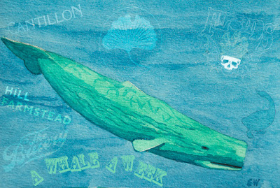
Now in my second year, A Whale A Week is my challenge to try (with an array of beer loving friends) a rare beer for every week of the year.  Last year I had a great time with this and have continued it for 2016.  Not every beer will be a truly "white whale" beer, but all are hard to find and a treat to try!  I've been kind of bad about keeping up on this the past few months--maybe I should rename this to A Whale Every Other Week...

Jester King Nocturn Chrysalis Blend 2

Jester King Brewery is a wonderful brewery out of Austin, Texas specializing in sour beers.  Their beers eschew classic Belgian styles and really chart their own course, but still have the quality and complexity that good sours should have.  I've reviewed their Atrial Rubicite HERE for a previous Whale A Week.  

Nocturn Chrysalis starts as a sour red ale, and is then barrel aged with a large amount of fresh blackberries.  For this second batch (April 2014) they used Marionberries from Oregon.  ABV is 5.9%, Final Gravity 1.000, pH 3.3. The beer has a score of 93 on Beer Advocate and 99 on Rate Beer. 


Cast of characters: Me (homebrewer for over 25 years, lover and brewer of sour beers); Sarajo (my wife and fan of sours); and fellow Jack Of All Brews member and award winning brewer Josh Welch. 


Nocturn Chrysalis 

Aroma: 

Eric: Mellow blackberry aroma.  Light tartness.  Hint of sweet berry.  Light sulfur notes.  Brett--funky leather as it warms up.
Josh: Strong smells of wet hay, slight solvent, light jammy fruit.  

Appearance:

Eric: Deep red to nearly magenta.  Persistent wispy off-pink froth.  Excellent clarity and ruby sparkles.
Josh: Slight white head.  Good clarity.  Nice purple color from the fruit.  No legs, rolls easily in the glass.

Flavor:

Eric: Ooh!  Up front very dry and tannic--almost leathery.  Middle of taste coats the tongue with dry berry and cherry pit flavors.  Finish lingers with distinct blackberry, funk, and oak tannins.  Spritzy and has a very light mouthfeel.  Dry but not astringent.  Fruit still shows through nicely despite age and dryness.  Not overly acidic.
Josh: Less aggressive than the aroma.  Dry, light acidity, effervescent.  Modest apparent sweetness.

Overall:

Eric: Wow!  I really love this use of blackberry!  Dry but mellow and the fruit is really present.  compared to last week's Beatification which was all acid and little brett, this one is mostly brett and mild acid.  Refreshing, palate cleansing--makes me want to keep drinking it.  4.75
Josh: 4.5
Sarajo: Tart and refreshing.  4.5

Overall Score: 4.67


Wednesday, July 6, 2016

2016 PhotoChallenge Week 26: Outdoor - Water (Long Exposure)

At the end of last year I discovered Photochallenge.org.  This is a small group of photographers who set forth a weekly challenge to other professional and amateur photographers.  What I was drawn to with this weekly assignment is that is pushes you to try new techniques and get out and take pictures on a weekly basis.  I'm taking part again this year and will also do a quick blog post about each of them.  The rules of the challenge do require that these are new pictures, not from your back catalog.  With my busy work schedule, I may not be able to get out each week and do this, so I will likely add a few of my older photos on the blog--taking the opportunity to look at the plethora of pictures I've taken and actually do some processing and weeding.

2016 PhotoChallenge Week 26: Outdoor - Water - (Long Exposure)

This past week's challenge was to capture the motion of water using long exposure (slow shutter speed). By leaving the camera's shutter open longer it collects more of the water's motion resulting in a blur of white, while the background (not moving) is kept sharp.  I actually took a landscape photography class at the Minnesota Landscape Arboretum taught by John Penoyer the day prior to the challenge being posted.  The day was brutally hot, windy and sunny so wasn't ideal for these shots.  However, the next day was less terrible and I went back out to test out my new skills.  As I was walking to my car I checked the PhotoChallenge.org weekly challenge on my phone and was pleasantly shocked to find this particular one waiting for me!

This technique requires a few things and special settings to make work.  First off you need a tripod to keep the camera in the same position. Any movement (doing it by hand) will often result in a blurry effect of the whole shot.  Also movement by wind can affect things--many of the shots I took looked great but the tree limbs in the foreground were blurry from having been tossed around by wind.  You will need to set your ISO low (100 ideally) to keep down noise in the photo, but also to allow for longer shutter speeds.  Smaller aperture size will also allow less light in and allow for longer shutter speeds (I used from 16-20 on these shots).  There was still enough light on the day I was shooting that most of my shots ended up being overexposed even with these settings so I added a polarizing filter:  this will cut glare from sun, as well as darken by up to 2-3 stops--giving me a bit longer on shutter speed.  


1) Moss and Falls:  This is my favorite of my shots.  This is actually a man-made waterfall, but sure looks great!  I feel that the cascade of water looks pretty good in this one.  


2) Small Fall:  This is further downstream from the previous falls and is really only a trickle.  I upset a female Cardinal bathing in the pool below this but had my camera settings too weird to get a good shot.  I did darken the rock in the foreground with Lightroom since a ray of light was making it way to bright for the shot to look good. 


3) Step-Off:  This is another tiny man-made falls near the Koi pond.  Not my favorite shot but captures the water motion. 


4) Wachlella Falls:  I took this one in Oregon recently.  Without a tripod I actually hand-held this one while crouched on my hands and knees to minimize shake.  I'd love to visit again with my new skills and equipment!


5) Abstract Koi: While set up to take pictures of the Japanese Garden waterfall (those didn't turn out) I kept being distracted by the movements of koi in the pond just below me.  I aimed my camera down and kept my long shutter speed settings.  The trails of fish and things floating on the surface of the murky water ended up looking pretty cool!

Wednesday, June 29, 2016

A Whale A Week: Russian River Beatification 2013

Now in my second year, A Whale A Week is my challenge to try (with an array of beer loving friends) a rare beer for every week of the year.  Last year I had a great time with this and have continued it for 2016.  Not every beer will be a truly "white whale" beer, but all are hard to find and a treat to try!  I've been kind of bad about keeping up on this the past few months--maybe I should rename this to A Whale Every Other Week...


Russian River Beatification 2013

Russian River Brewing has been putting out some amazing beers over the years (Pliny the Elder and Blind Pig IPA's) but have really been one of the first American breweries to put out sour Belgian style beers.  Not content to do everything by the book, the the brewers certainly put their own spin on things.  Not available here in Minnesota, I managed to get my hands on some vintage bottles and figured this would be a good time to break one out!

Beatification is a golden ale that is based loosely on old school Belgian wild fermention like that seen at Cantillon.  The hot wort is left in a wide, open, coolship overnight to cool and become inoculated with wild yeast and bacteria from the brewhouse.  It is then transferred to oak wine barrels and fermented several months.  It comes out about 6% ABV and of variable tartness/funkiness. Beer Advocate gives this a score of 99 and Rate Beer a 100.  

The word beatification is used by the Roman Catholic Church as a papal declaration that a dead person is enjoying the pleasure of heaven and is worthy of religious honor.  This is the first step toward becoming canonized or sainted.  Interesting!

Cast of characters for this tasting: Me (homebrewer for over 25 years, lover and brewer of sour beers); Sarajo (my wife and fan of sours); and fellow Jack Of All Brews member and award winning brewer Josh Welch. 


Beatification

Aroma:

Eric: Bright.  Pineapple is very strong.  Tartness is powerful.  Tangerines or Mandarin oranges.  Light plastic notes as warms.  Wax--honeycomb.  Thai basil.
Josh: Strong phenolic funk aroma.  Fresh leather.  Light solvent.

Appearance:

Eric: Straw in color, very light.  Crystal clear.  Small white head with tiny tight bubbles.  Head fades to edge of glass quickly.
Josh: Very good looking beer.  Crystal clear, pale golden.  No head.

Flavor:

Eric:  Very tart up front.  Fades to a tart middle.  Ends with a tart finish.  So...tart.  Puckering.  Unripe pineapple and green apple skin.  Very mild wheat malt.  Acetic acid is very strong in this beer.  Some mild brett funk, but mostly acetobacter.
Josh: Acidic tangy, lemon, salty.  Slick on the mouth.  Light.  Acidity lingers for some time.

Overall:

Eric: A very zippy and interesting beer but somewhat one dimensional.  All acid all the time!  I want more brett character in the flavor like I get in the aroma.  Not quite refreshing since I feel the need to wash my palate with water after this.  And a Zantac.  I have had another version of this that I gave a 5 to, but this one is a 4.
Josh: 4.25
Sarajo: Acid-O-Licious!  4

Overall Score: 4.08