At the end of last year I discovered Photochallenge.org. This is a small group of photographers who set forth a weekly challenge to other professional and amateur photographers. What I was drawn to with this weekly assignment is that is pushes you to try new techniques and get out and take pictures on a weekly basis. I'm taking part again this year and will also do a quick blog post about each of them. The rules of the challenge do require that these are new pictures, not from your back catalogue. With my busy work schedule, I may not be able to get out each week and do this, so I will likely add a few of my older photos on the blog--taking the opportunity to look at the plethora of pictures I've taken and actually do some processing and weeding.
2016 Photochallenge.org Week 12: Still Life, Dutch Masters
This past week's Photochallenge.org assignment was to do a still life, taking inspiration from the Dutch Masters' paintings. Here's an example below that appeals to my morbid sensibilities.
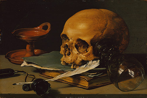
The idea with this challenge was to take one of the three main styles of still life from this period and work on lighting and placement of objects in a controlled setting. This one really spoke to me and I've been meaning to mess around with this technique for a while. The Dutch Masters were fond of realism and really worked to capture the effect of light on their subjects.
1) Vanitas: The first of the main styles of still life in this period is Vanitas--focusing on the vanity of earthly life. The picture above characterizes the subset quite well.

Here's my first attempt at the Vanitas style. I picked a creepy (fake) skull as a centerpoint. I used my special edition of the movie The Evil Dead with its quasi-demonic illustrations to bring a little color in to this. Some stacks of other books and my father-in-law's old dagger completed the tableau. Yes this is a little evil looking but I kind of like how it turned out. I used a black sheet draped over a table and up over the banister of the stairs for a backdrop, with a small LED table lamp above and to the left for lighting. I also desaturated this picture a bit and dropped the clarity to make it a bit more surreal looking and less warm than the base shot. Since my mother-in-law reads this blog: I am not summoning demons in my spare time, this is all just special effects!

Here's my second in the series. I pulled out some questionable medical devices, a phrenology bust, and one of my wife's elixir bottles. I like the look of this one and think it points out the frailty of man's body and perhaps mind (if you take the sprinkles of sea salt as something less wholesome).
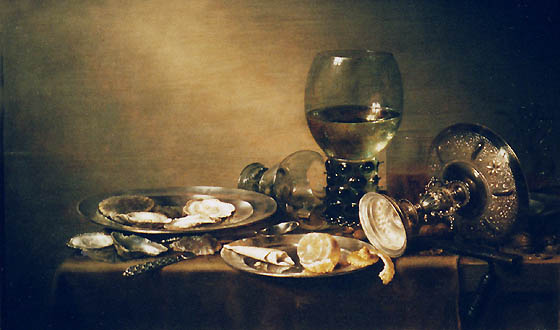
2) Pronk: This style focuses on excess--showing off basically! The classics used rare imported foods, fancy china, luxurious textiles. The painting below shows silver utensils and fancy glassware as well as rare foods.

My version probably lies somewhere between Pronk and Vanitas. I aimed to have a feel of travel as the main thread in this shot. Jules Verne was famous for his fantastical travel stories like Around the World In 80 Days, and the globe in the background accentuates that feel. The Dictionary of Imaginary Places, fairy tales, and the dragon's egg (from Snobhog Studio) bring in an aspect of fantasy to it as well. I added a fine painting filter in Photoshop Elements to accentuate the look of this and give it a more timeless feel.
No comments:
Post a Comment